Making visaully attractive posters in ConTeXt
Posters are not or rather were not too common in my research field, so I have never really had a need to create posters. But this is now changing and every now and then, we have to make a poster presentation. I have looked at the different options available for creating posters (see, for example, this TeX.SE post) but I find all of them to be boring. Given that poster sessions are crammed, it is important to create a poster that is visually distinct. So, when it came time to create a poster for a paper that we will be presenting at NecSys 2018 next week, we started looking at something visually distinct. Inspired by a template that my co-author, Mohammad, found, we created the poster shown below.
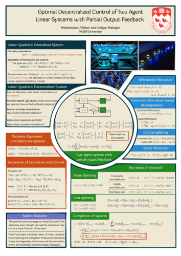
I rather like the design. It has nice balance and harmony. I didn’t like the colors used in the template, so we replaced them by colors from the solarized palette. When printed on A0 sized fabric, this looks gorgeous.
The poster was created using ConTeXt. We were against a deadline and trying to
fine-tune the visual layout. So, the actual .tex file has a lot of
spaghetti code. So, I’ll not share the code for now, but explain our thought
process while creating this.
-
We start with the layout and set 1in margins on all sizes (on A0 paper, these margins are tiny).
\setuppapersize[A0] \setuplayout [ cutspace=1in, leftmargin=1in, leftmargindistance=0mm, width=middle, rightmargindistance=0mm, rightmargin=1in, backspace=1in, % topspace=1in, header=0mm, headerdistance=0mm, height=middle, footerdistance=0mm, footer=0mm, bottomspace=1in, columns=6, columndistance=0.5em, ] \setuppagenumbering[location=] -
Next, we set the fonts. I typically use [Diavlo] plus [Euler] for my presentations, so we stick with the same combination here.
\usetypescriptfile[diavlo, delicious, euler, dejavu]

 \definetypeface[posterfont][rm][serif][diavlo][default]
 \definetypeface[posterfont][ss][sans] [delicious][default]
 \definetypeface[posterfont][mm][math] [pagellaovereuler][default]
 \definetypeface[posterfont][tt][mono] [dejavu][default] [rscale=0.85, features=none]


 \definebodyfontenvironment[24pt]
 \definebodyfontenvironment[32pt]
 \definebodyfontenvironment[44pt]
 \definebodyfontenvironment[72pt]

 \setupbodyfont[posterfont,32pt]
 \setupmathematics[default=normal, lcgreek=normal, ucgreek=normal]
-
Next, we create a background layer called
page:highlightfor drawing the different shapes. We also define a layer calledtext, which we will use to write all the text.\setupbackgrounds[page][background=color, backgroundcolor=background:dark] \defineoverlay [page:highlight][\useMPgraphic{page:highlight}] \definelayer [text] \setupbackgrounds[text][background={page:highlight,text,foreground}] \startuseMPgraphic{page:highlight} StartPage; ... StopPage; \stopuseMPgraphicThis gives us the poster outline shown below. Note that I am using the trick of randomly perturbing the outline of each cell and drawing it multiple times to get the effect of hand drawn lines.
-
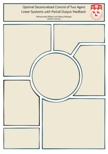
Now, we use the layers mechanism to place all the context (on top of the background). We start with the poster title and logo:
\setlayerframed[text]
          [line=0, column=1]
          [
            width=\textwidth,
            background=color,
            backgroundcolor=background:light,
            align=middle,
            framecolor=contrastcolor,
            rulethickness=0.2in,
            frame=on,
            foregroundstyle={\switchtobodyfont[72pt]},
            toffset=0.1\lineheight,
            boffset=1.4\lineheight,
          ]
          {...}

 \setlayer[text]
          [line=1, column=6,x=0.125\layoutcolumnwidth]
          {...}
This gives the following.
-
The rest of the content can be filled in a similar manner. We place the content of each cell using
\setlayerframed. But what about the non-rectangular shapes? It is possible to ask ConTeXt to typeset text in a non-rectangular shape, but for something as simple as this poster, I prefer to manually break lines to give the impression of a non-rectangular shape. For example, this is the code for the middle block. Lot’s of manual tweaking of the space, but it works!\setlayerframed[text] [line=45, x=1.75\layoutcolumnwidth] [width=\dimexpr(3\layoutcolumnwidth-0.5in)\relax, frame=off, align=normal] { $\MATRIX{x_1(t+1) ; x_2(t+1)} = \MATRIX{ A_{11}, 0; A_{21}, A_{22} } \MATRIX{ x_1(t); x_2(t) } + \MATRIX{ B_{11}, 0; B_{21}, B_{22} } \MATRIX{ u_1(t); u_2(t) } + \MATRIX{ w_1(t); w_2(t) }$ \blank[line,fixed] \hskip 1em $\MATRIX{y_{1}(t) ; y_{2}(t)} = \MATRIX{ I, 0; C_{21}, C_{22} } \MATRIX{ x_1(t); x_2(t) } + \MATRIX{ 0; v_2(t) }$ \quad \randomized[width=0.8\layoutcolumnwidth, location=lohi] {Noise need not be Gaussian} \blank[0.85\lineheight,fixed] \hskip 0.5\layoutcolumnwidth $J = \mathbb{E}\Bigl[ \displaystyle \sum_{t=1}^{T-1} \Bigl[ \NORM{x(t)}{Q} + \NORM{u(t)}{R} \Bigr] + \NORM{x(T)}{Q} \Bigr]$ } \setlayerframed[text] [y=34\LineHeight, x=\dimexpr(2.5\layoutcolumnwidth+0.5cm)] [width=fit, frame=off, foregroundstyle={\switchtobodyfont[44pt]\bf}, foregroundcolor=background:light, align=middle] {Two-agent system with \\ partial output feedback}We also drew the background for the headings of each block in MetaPost so that these could be clipped to the different shape.
That’s it! Layers really make it very simple to create visually attractive non-linear posters.